Design & Art Samples
3D: Human Factors
Alarm Clock
Wireless Headsets
NEEMO
3D: Random Products
Travel Soapdish
See Shelf
2D: HCI
LESTER Web Portal
HSIS Web Application
EMR Form
2D: Random
Personal Logo
Figure Drawings
Napkin Sketches
Alarm clock redesign
This was a class project I did early on at Rice to redesign an existing
product. I chose my alarm clock radio, for which I felt the basic
shape and placement of the controls could be improved. I presented
my sketches to the class along with a basic task analysis and typical
usage scenarios.
Original Alarm | Final
Concepts

LESTER
portal
The LESTER portal was a web usability project that grew out of an
HCI Methods course. After extensive user research (interviews, questionnaires,
user tests), I developed some prototype designs for a new version
of the existing website. For the developer I developed the style
sheet, graphics, logo, and basic layout of the interface. Many of
the layout suggestions were later constrained, however, due to the
decision to use an existing portal software (reduced developer time).
While I was unhappy with the outcome, it was a good lesson in real-world
usability constraints.
website
Travel
Soapdish
This was a quick concept for a travel soap dish (ABS) I came up
with in a product design elective at Rice. After speaking with fabricators
and discovering the cost of injection molding (necessary due to
the tolerances on the interlocking pieces), it was left as a concept.
Front | Profile
See
Shelf
See Shelf was my final project for the product design elective I
took at Rice. I had originally decided to create a bent acrylic/aluminum
standing DVD tower, after seeing my roommates sprawling DVD collection.
However, again due to production costs, I was forced to miniaturize
the project, which brought me to the final See Shelf design. In
its final form, I found that it could be used best as a desktop
shelf/bookend for organizing small books and stationary items, as
well as CDs and DVDs. You can also see an early mockup on this webpage,
which I sent out a link for to various friends and family and asked
for feedback. The second preproduction prototype I handcrafted can
be best seen here.
Sketches | Final
Product (Lifestyle) | Final
Product 2
NEEMO
Habitat Design
This was primarily a research project, but there was a habitat
design component in our final report. Based on a video analysis
of crew activity in the small habitat, I came up with an improved
habitat design. Specifically, the redesign was guided by frequency
of use for each area of the habitat a la link analysis.
HSIS Web Application
As described on my research
page, I designed the interface for the Human-Systems Integration
Standards (HSIS) web application for NASA. Working together with
the developer, I created all of the graphics to be used on the pages
and determined the page layouts and information architecture based
on data collected in user tests and interviews. My deliverables
to the developer included page templates in HTML, image files, and
a style sheet.
Sample Layout
Wireless Headsets
As described on the research page, the focus of this project was
to determine human factors requirements for a wireless headset upgrade
to the ISS crew communications system. After conducting user tests
with commercial off-the-shelf headsets, I determined the requirements
for a wireless headset. Early concepts sketches were provided in
my report to the design group at NASA.
Sketches | More
to be posted
EMR Forms
I am evaluating EMR data entry forms at Baylor College of Medicine
Family Medicine Clinic. As part of the work described on the research
page, I will develop a new form in Microsoft Access. The form design
will be guided by data collected with the existing form, usability
principles, and findings from our lab and will be compared to the
original through user testing.
Sketches to be posted
Personal
Logo
Nearing graduation, I developed a personal logo for self-promotion
and practice. I considered a graphical logo, originally, but settled
on a logotype because I am not a company/business, and I mostly
wanted recognition of my name from the logo. What I settled on represents
interaction between human (serif) and technology (modern font),
with an artistic flair (brushstroke). The blue color of the brushstroke
represents my academic heritage (Rice and UConn). Exaggerated ascenders
were used to improve legibility at small sizes. I created the font
working from pencil overlays and finally tweaking it in Illustrator.
Sketches | Final
logo
Figure
Drawing
Mixed media (acrylic and charcoal) nude figure drawings done in
summer 2006.
Female | Man
Reading | Female Profile
| Female Torso | Older
Woman | Blocked Out
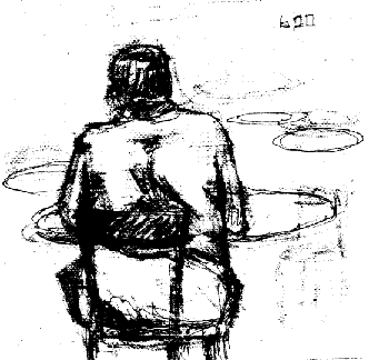
Napkin
Sketches
Quick sketches of people done on napkins while studying at a local
bookstore. They were done during my first year at Rice (2001). I
like them because they so aptly represent my life then.
Woman | Man
Other design and fine art done
prior to my years at Rice are in storage out of state and may be
posted at a later date.
Page last modified October 2, 2005 |
